


Bees, bunnies and a bear
Packing it up and making it stick

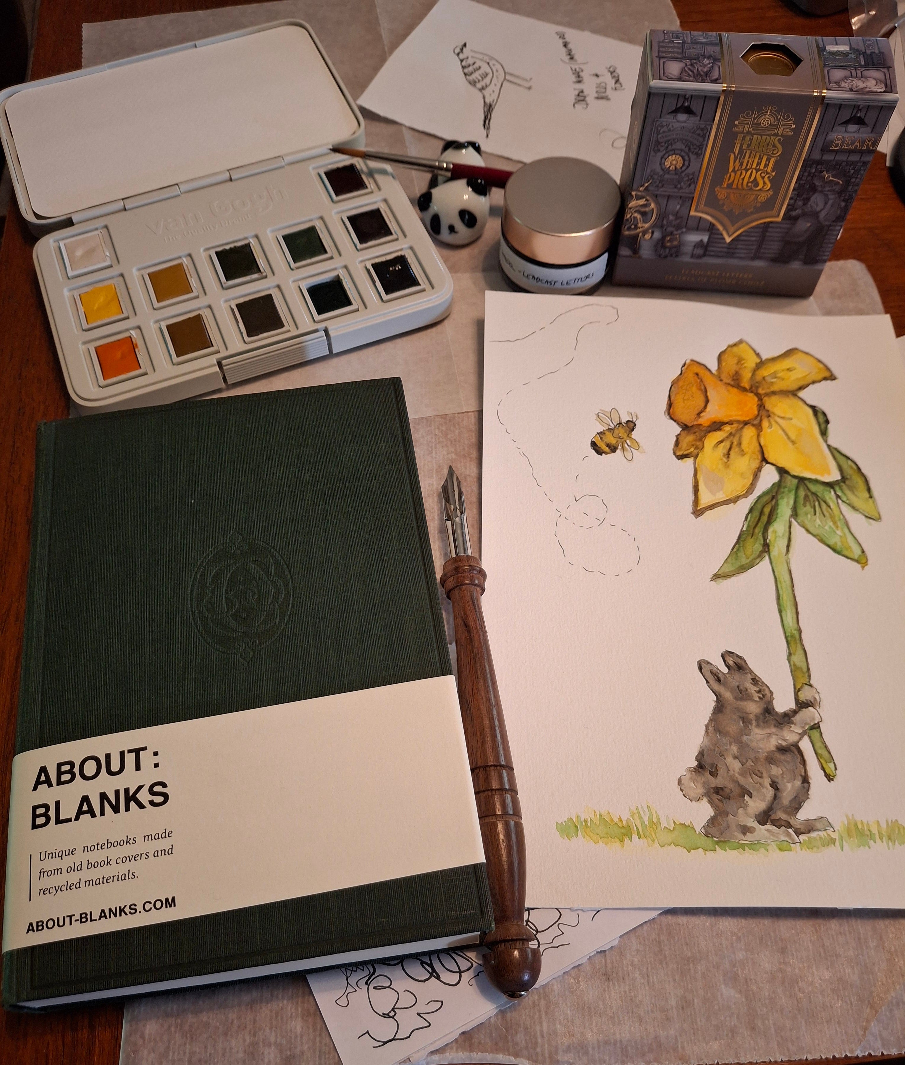
Over the long weekend we went to our favorite locally owned stationary store Eryngium Paperterie. I got a new dark grey ink made by Ferris Wheel called “Leadcast Letters”. I also got a new dip pen and a new blank book.
We also went to our locally owned garden nursery because
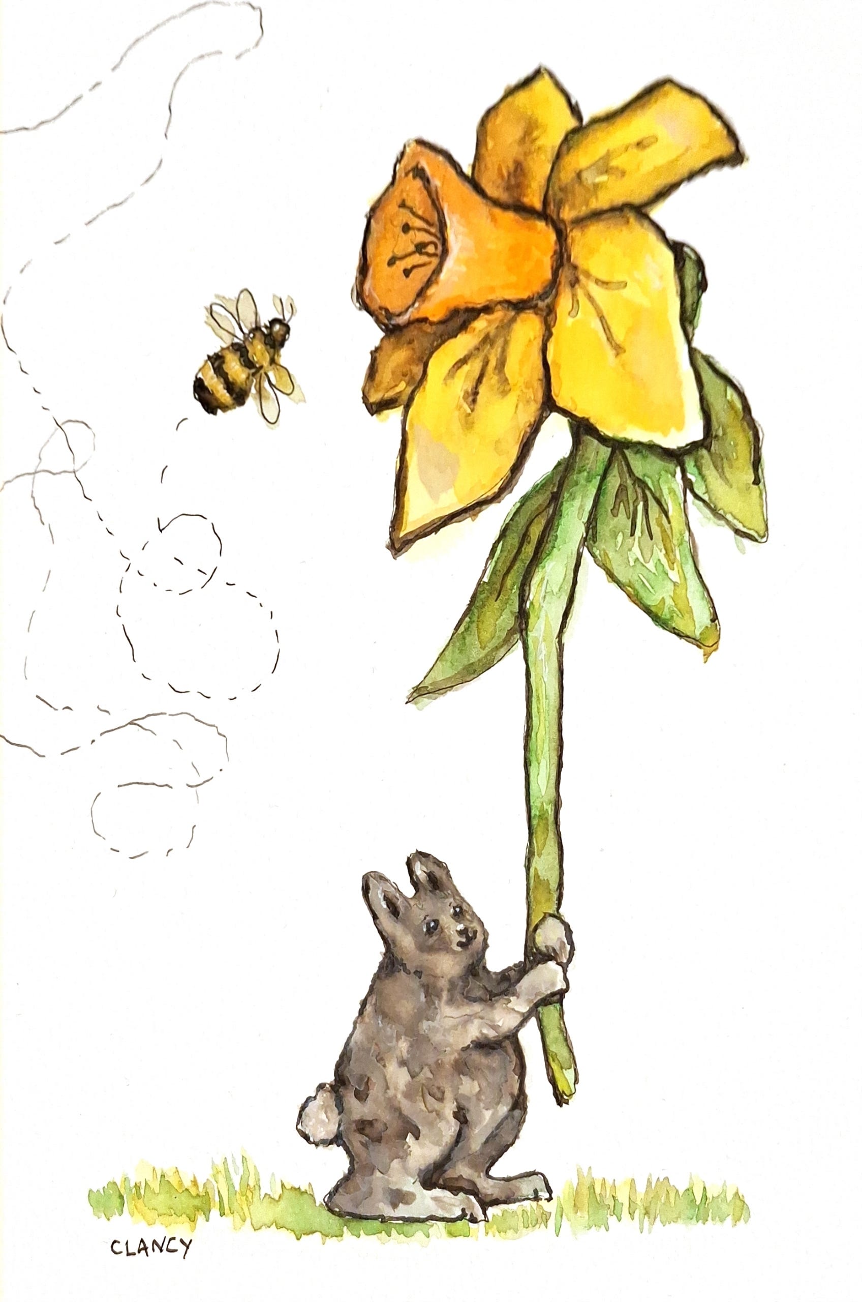
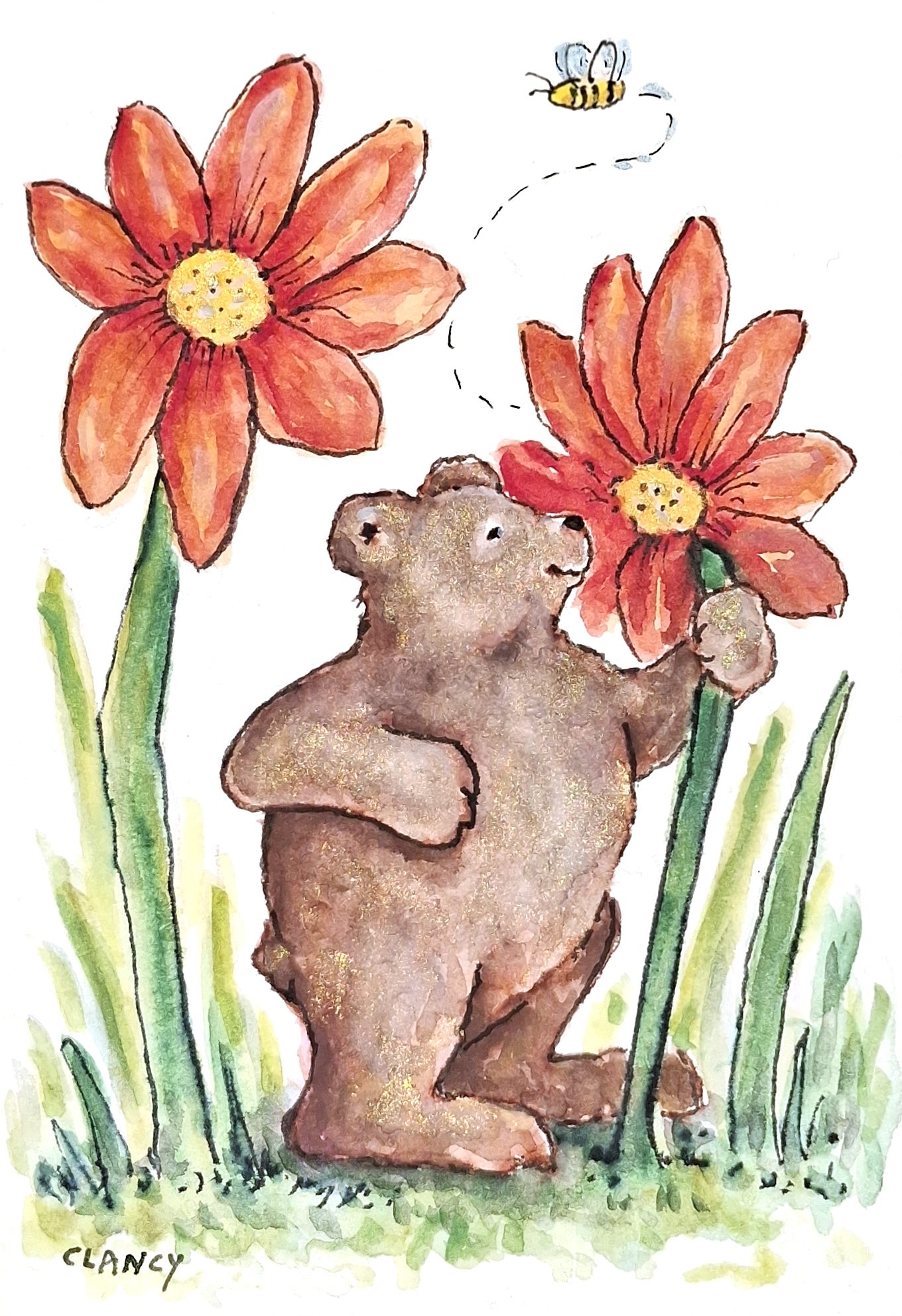
wanted some plants for our yard and I just like to look at the variety in the garden center.So this week during breakfast I've been drawing on a piece of watercolor paper with my watercolors and the new grey ink with my dip pen. (The blank book will wait till I need it. And you can never have too many notebooks1.) The garden nursery had daffodils and other flowers that were alive with bees. I also saw a rabbit hopping down the greenhouse isles. That's why I picked a daffodil and a rabbit character and of course a bee.
In the garden center there were some dahlias that were a color that seemed to my eye not quite red but not orange either…so I took this photo so I could look it up and try matching it with my paints later.
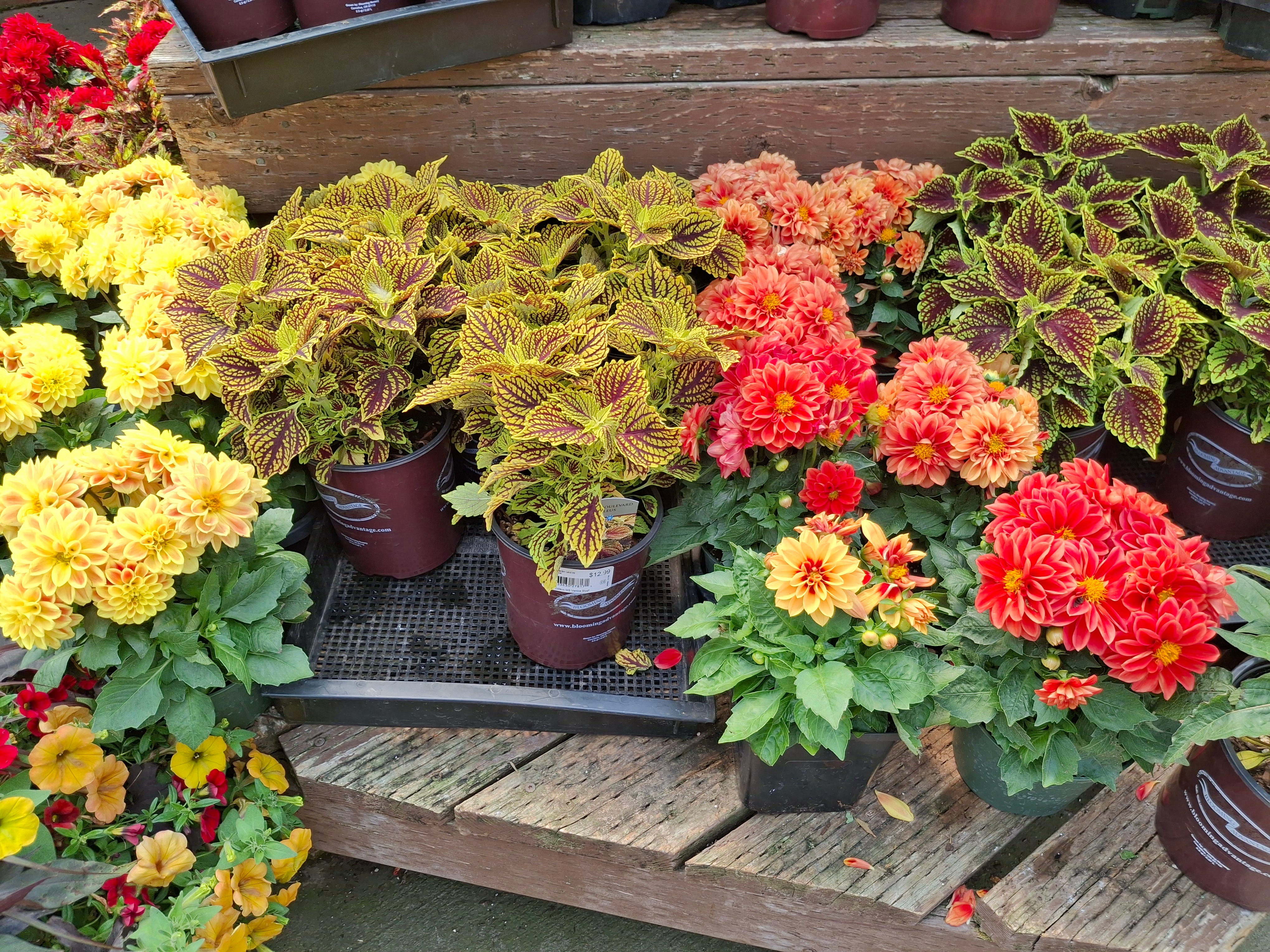
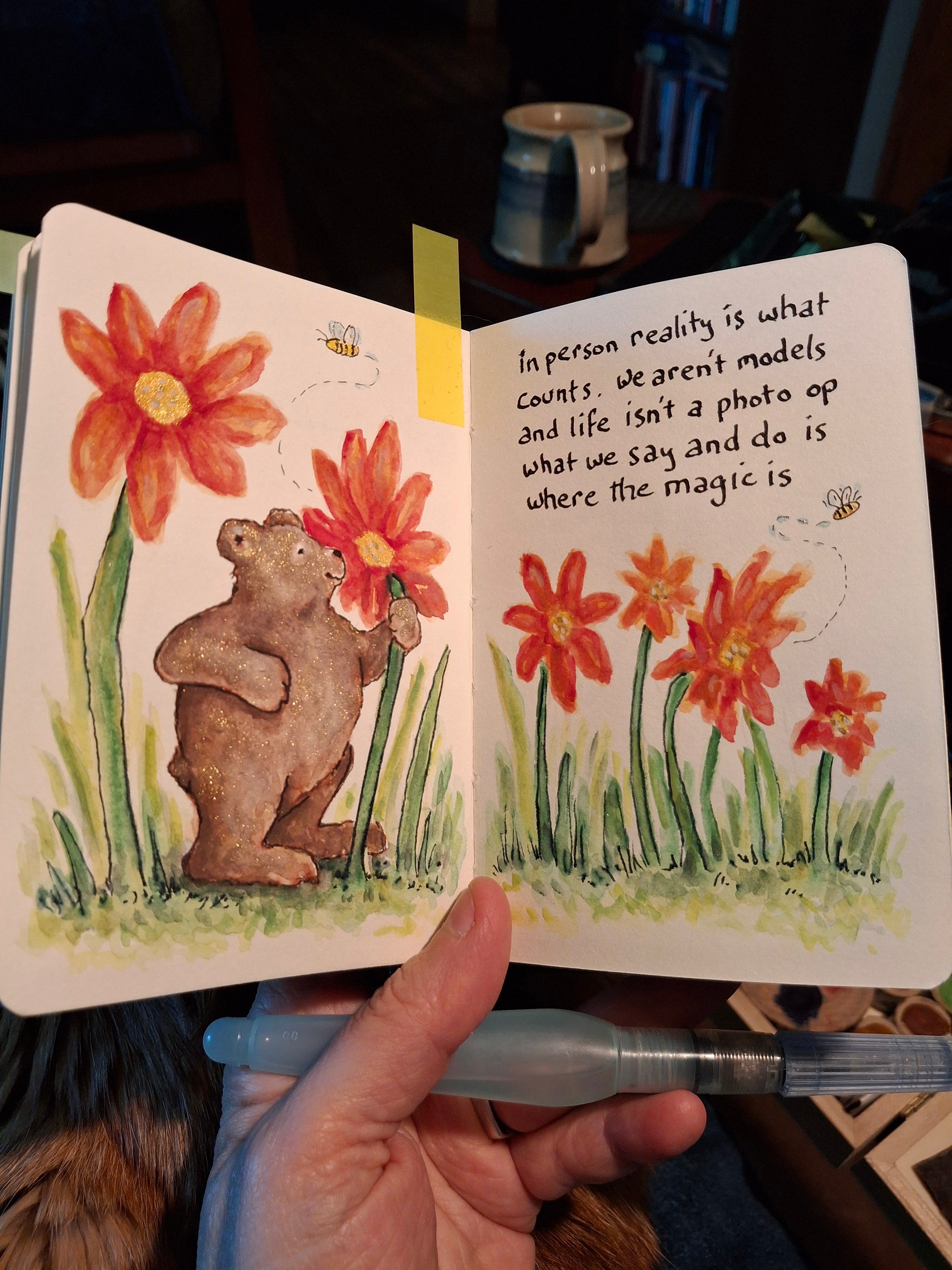
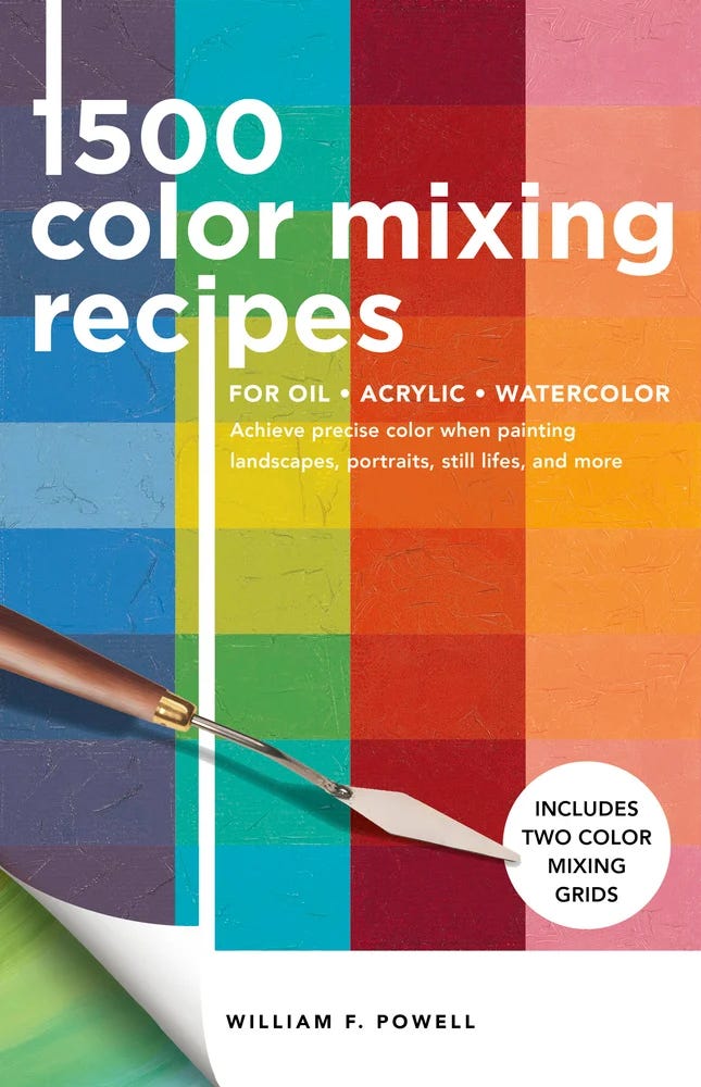
Our Fairy Goddaughter had given me a book “1500 Color Mixing Recipes” by William F. Powell2 and that's where I looked up colors until I found a match for the flowers I'd seen. As per the recipe in the book I used alizarin crimson, cadmium yellow light and white gouache paints mixed together to make the drawings flower petals. It's a close enough match to what I saw! The flowers in my drawing are imaginative daisy-like rather than any realistic flowers. I was trying to record something of the “expanding color” feeling I'd had in the garden center. I chose a bear character because of the delightful stone garden sculptural bear I saw nestled amongst the plants.
During breakfast over several days I worked on my sketchbook drawing. I put several layers of gouache paints on the page first and after the painting was dry, on another day, I used my fountain pen and ink to draw lines on top of the color. Here's a video look over my shoulder as I draw with the ink.
It was nice to slow down and smell the flowers at the garden nursery and then to continue a bit of the “relaxed doing nothing”3 feeling in my sketchbook.
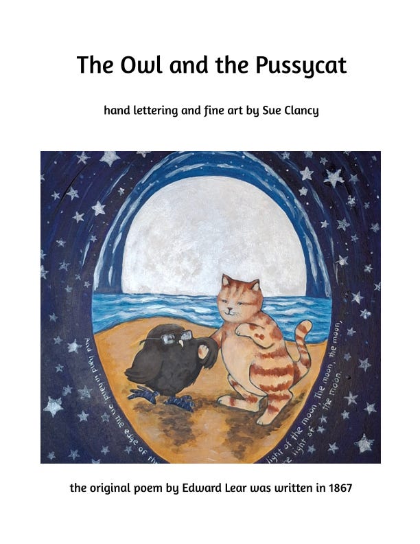
In my last post I was working slowly at framing a new series of my paintings for an upcoming exhibit via the Caplan Art Designs gallery, at the winery Burnt Bridge Cellars. Well, I finished all of it and have packed it for delivery soon. It feels like it takes up more space in my studio than it appears in the photo below. Here's a link to my exhibit book, both the print and ebook versions. I'll have 4 printed copies at my opening, First Friday, June 6 and otherwise this link is where the book can be found.4
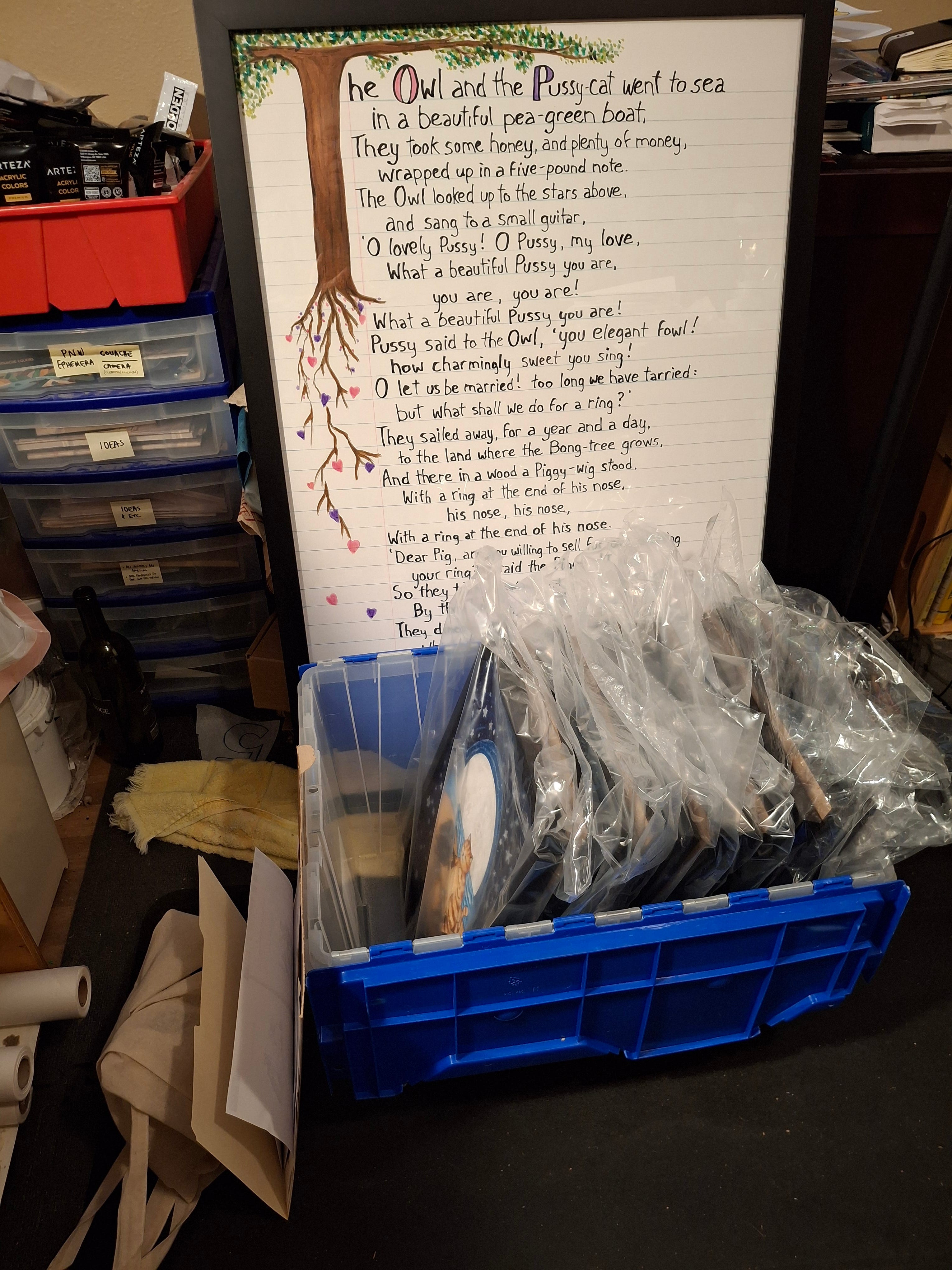
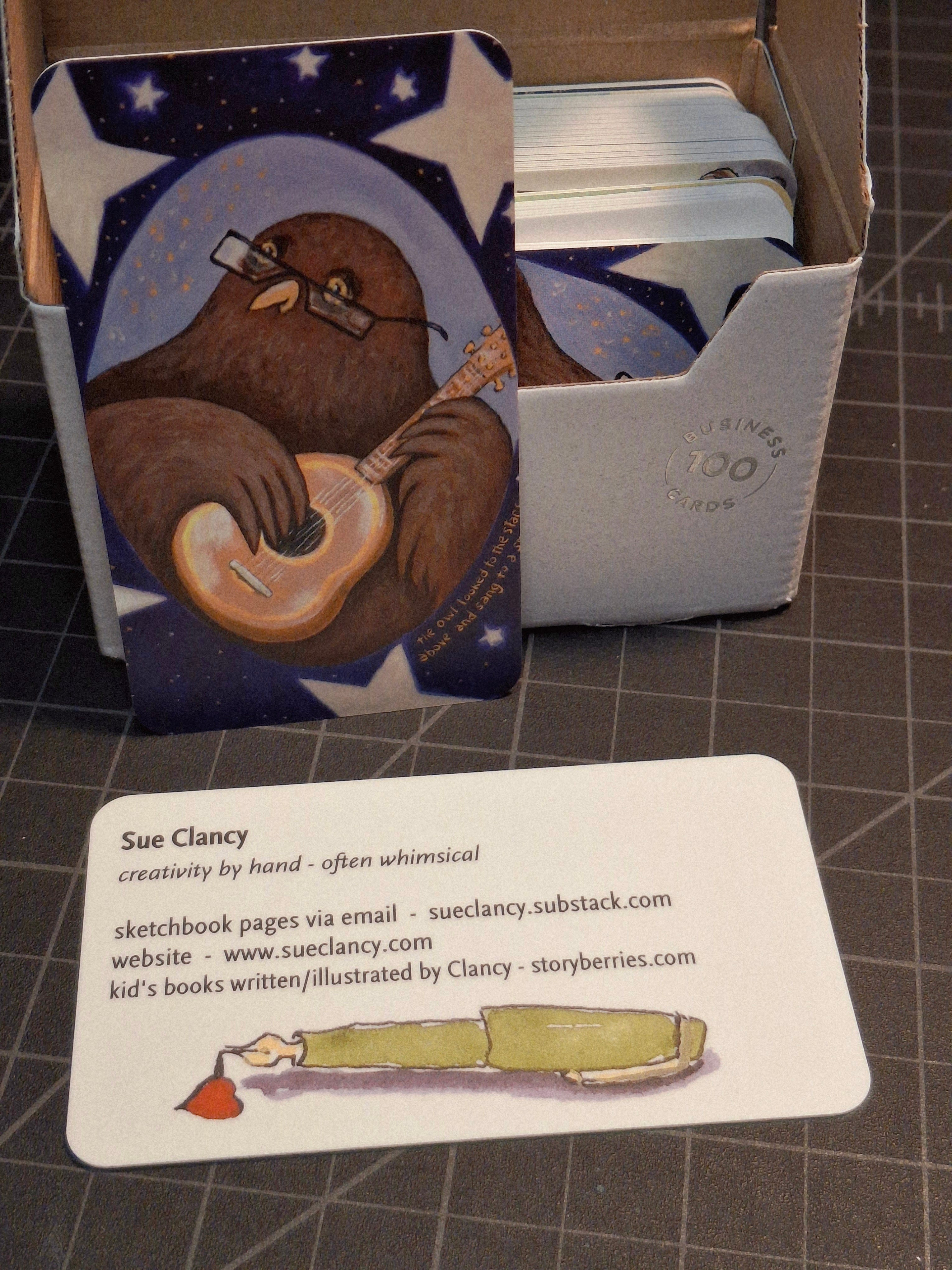
The winery likes having some of my business cards on hand in addition to the Caplan Art Designs gallery business cards. So I've made some new business cards with one of my owl artworks from my new series on one side and my information on the other side with my pen logo.
Here's a screenshot of what the winery has sent to their mailing list about the upcoming First Friday event.
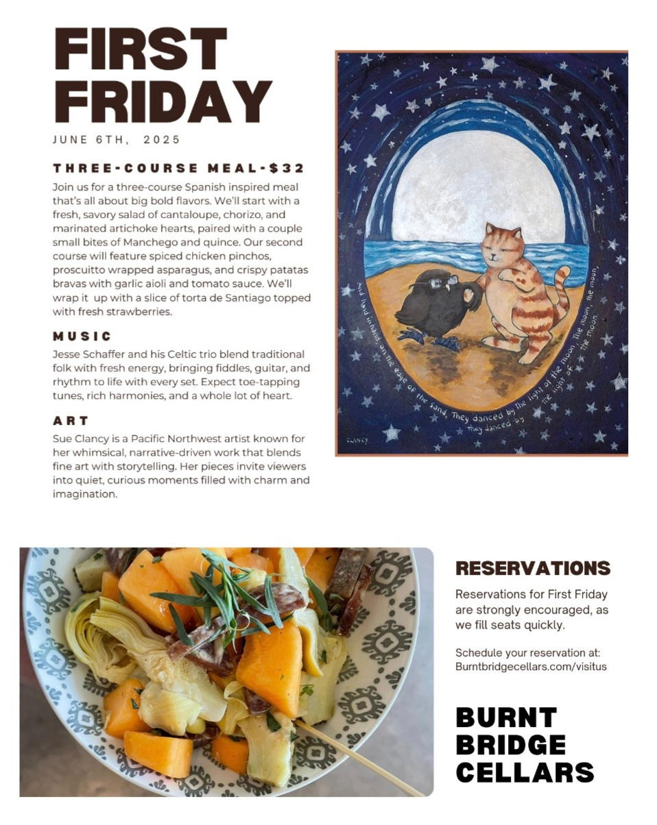
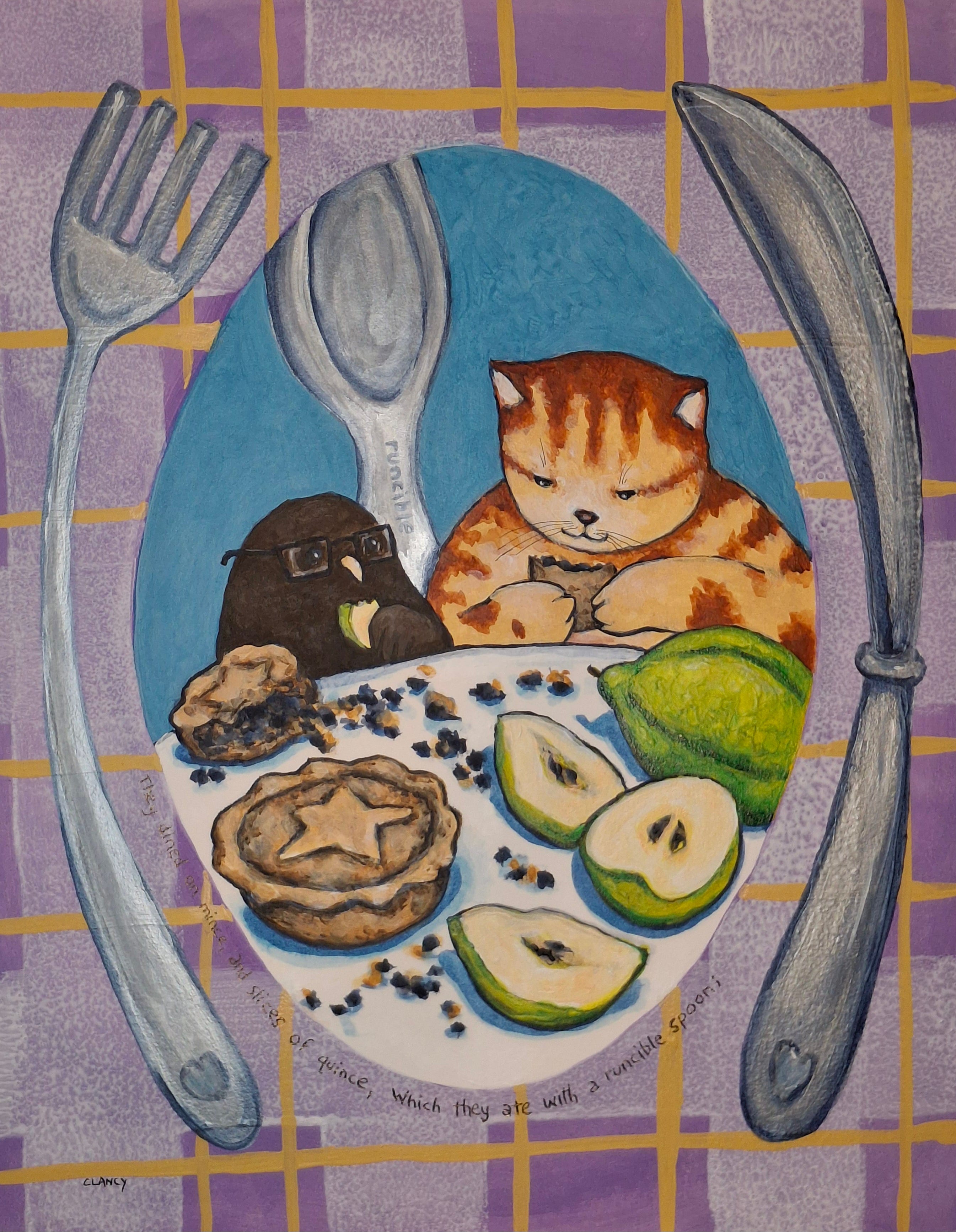
I loved seeing that the chef is preparing a dish that has quince in it! As you remember from my last post the poem that inspired my series of paintings has a line “…They dined on mince, and slices of quince, Which they ate with a runcible spoon;...” Here’s a look at my painting that accompanies that line.
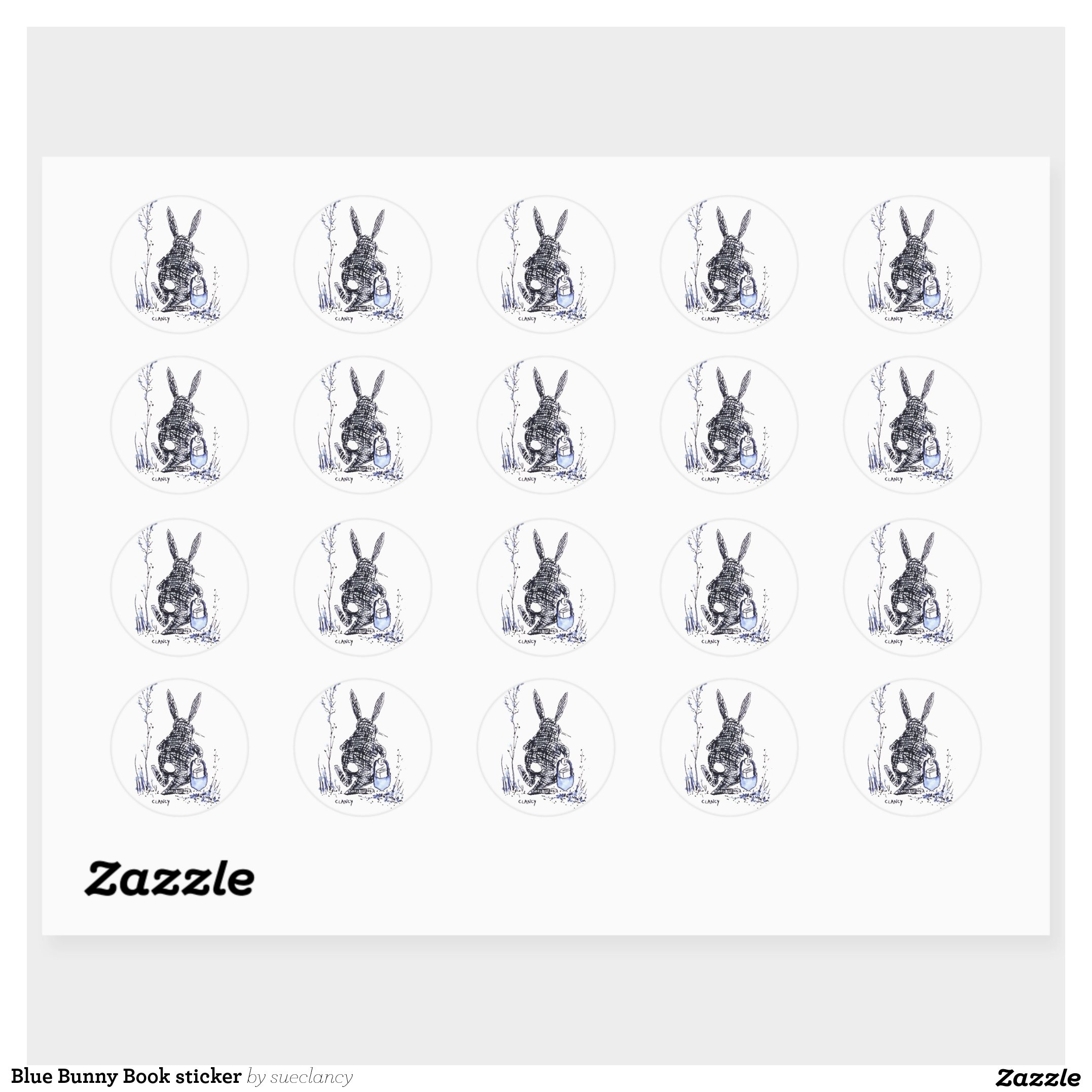
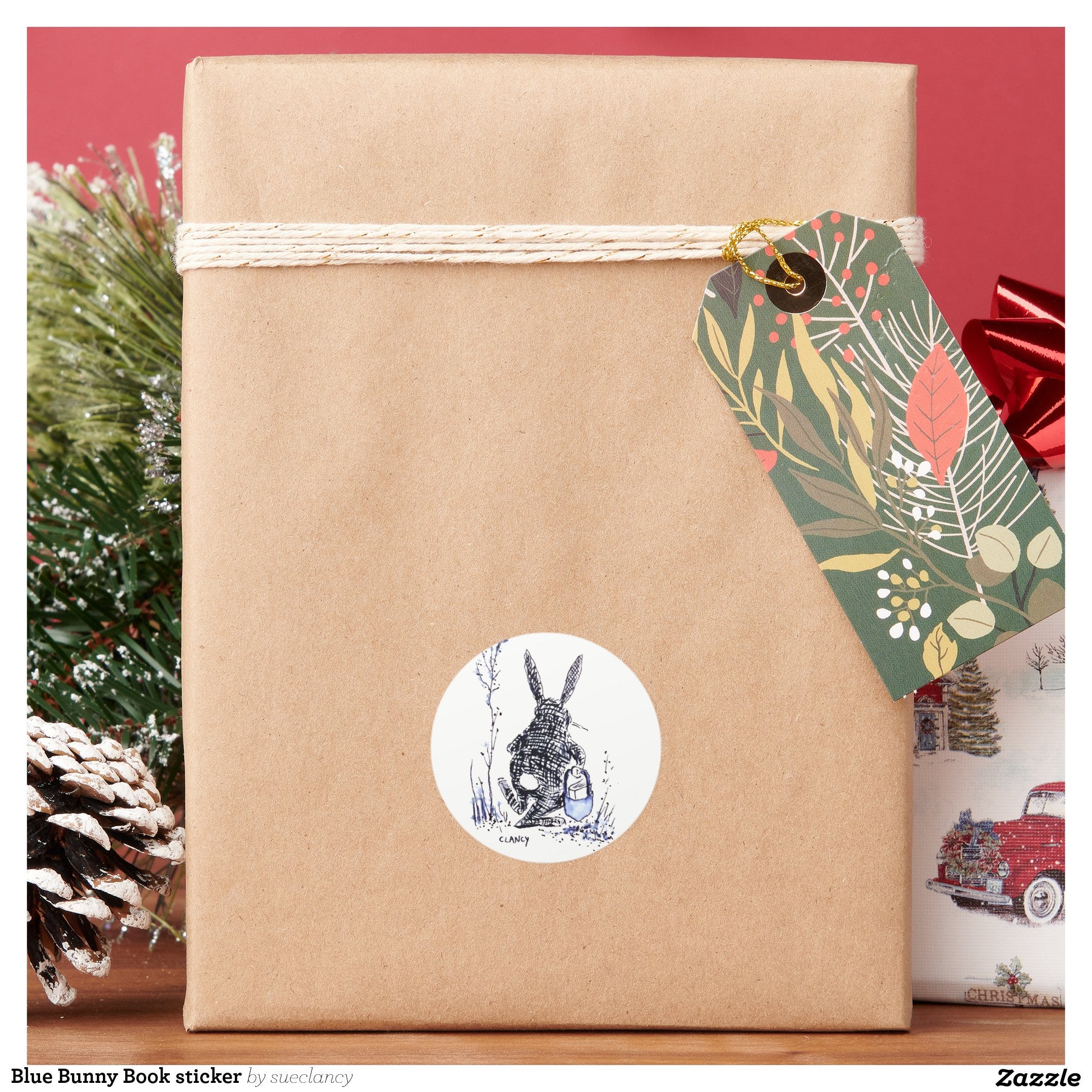
Recently someone asked me to make some special peel-and-stick stickers for them and I'd never made stickers before so I took an artwork I already had …
… and practiced the digital hocus pocus to turn my art into a sheet of stickers. It looks simple… now. (Link here)
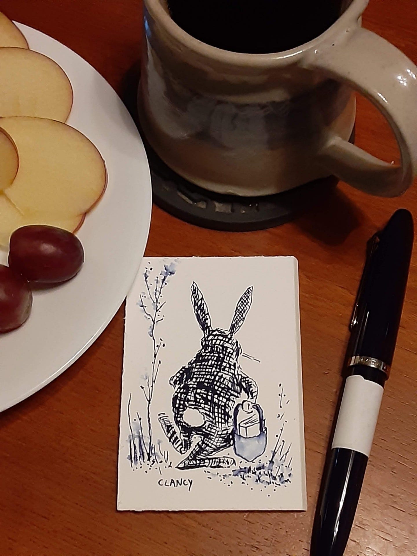
Here's a look at the new sticker on something.
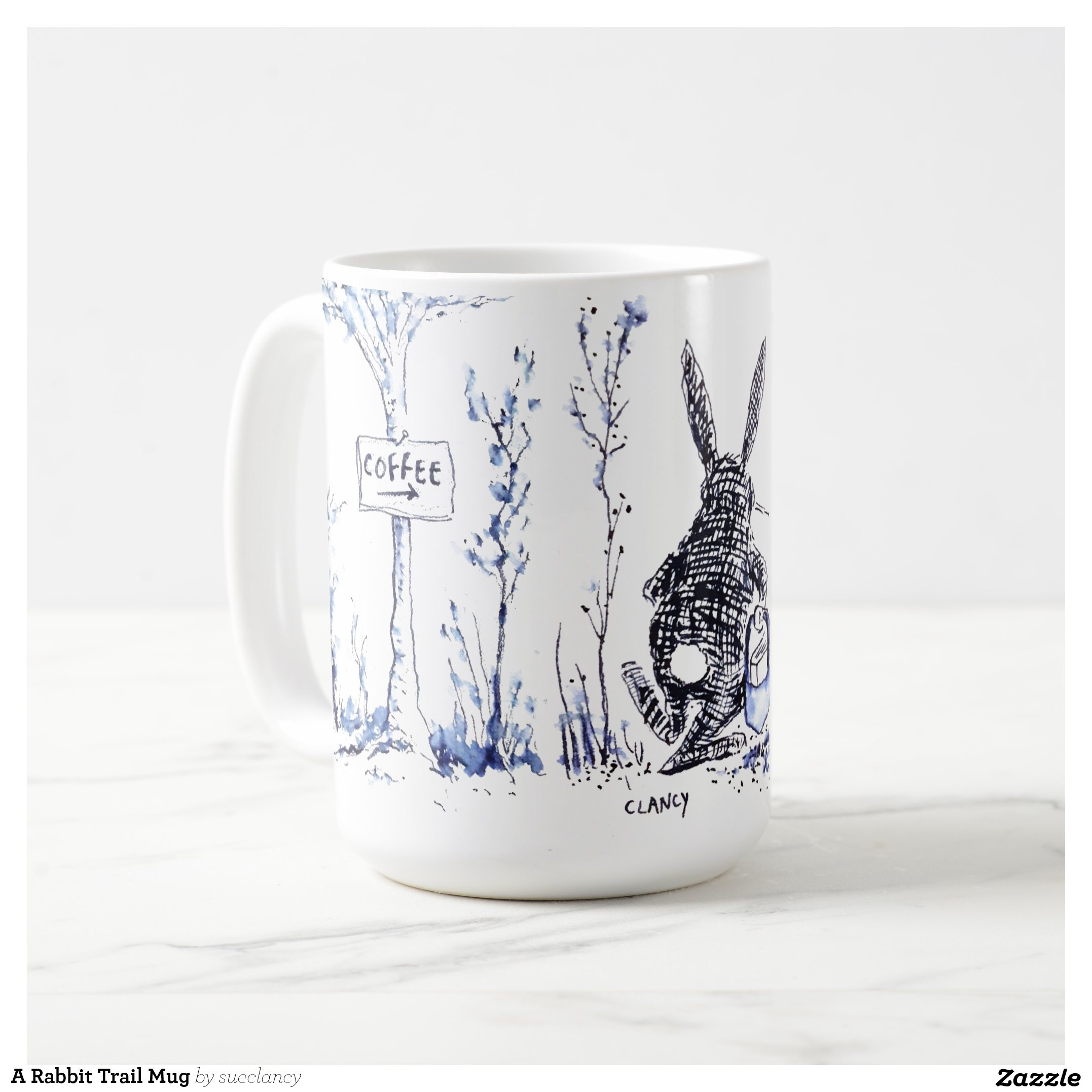
And here's the same art in it's natural habitat - a coffee cup. (Link here)
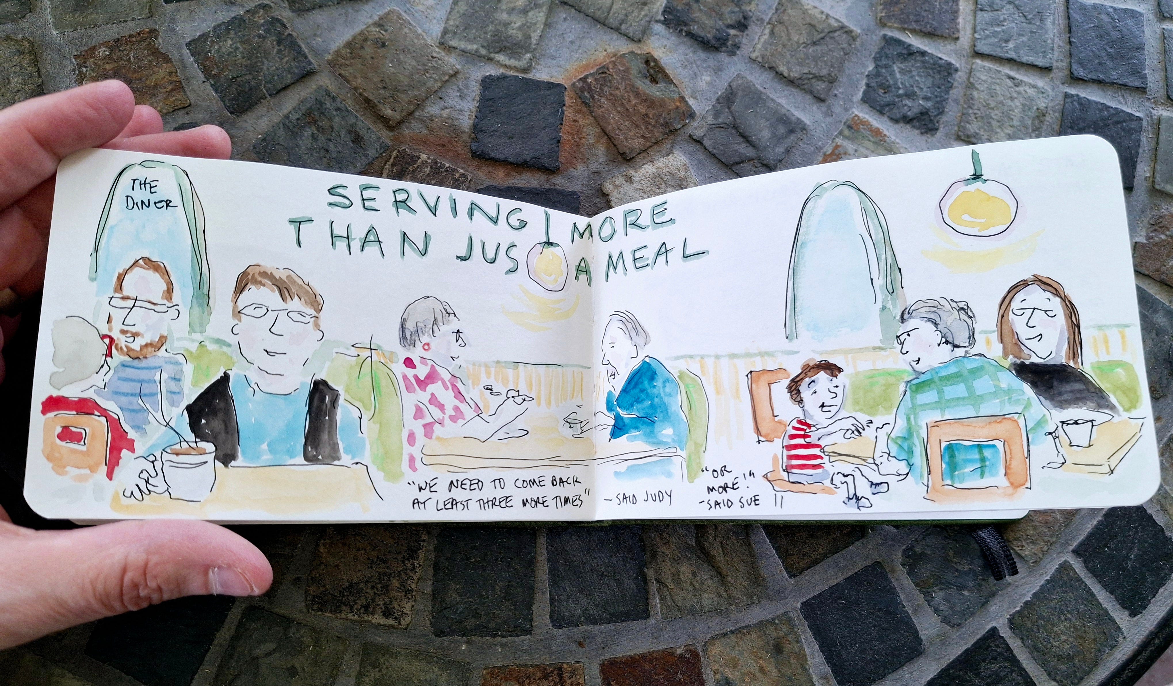
My sketchbook pages in the wild (so to speak): recently
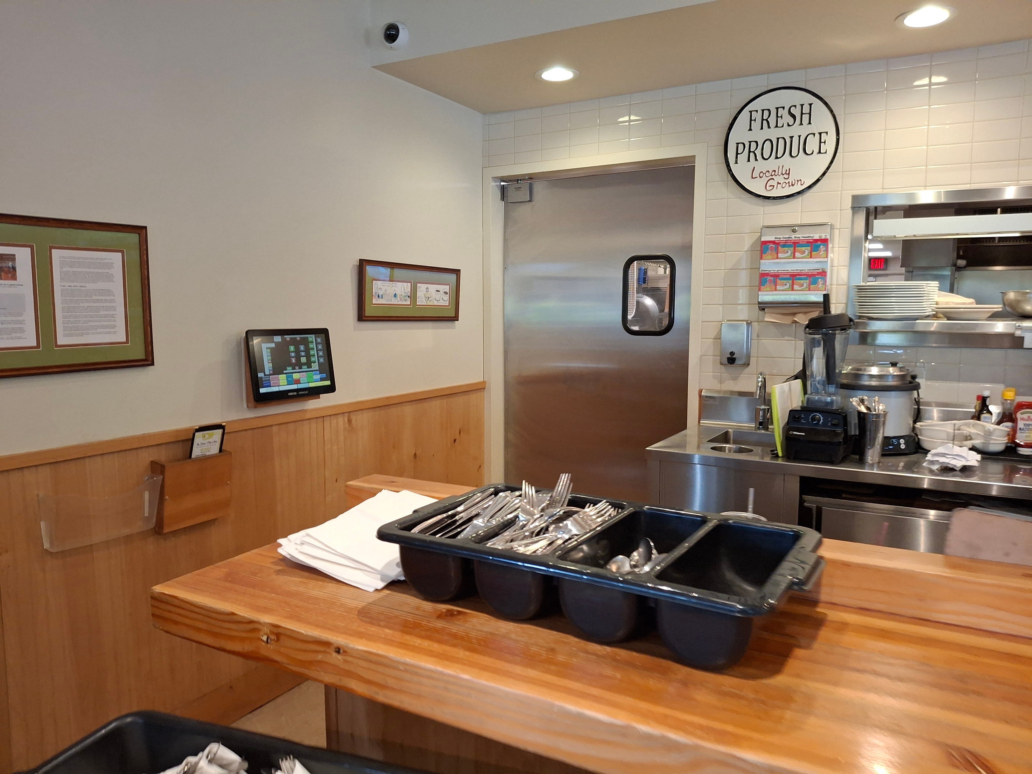
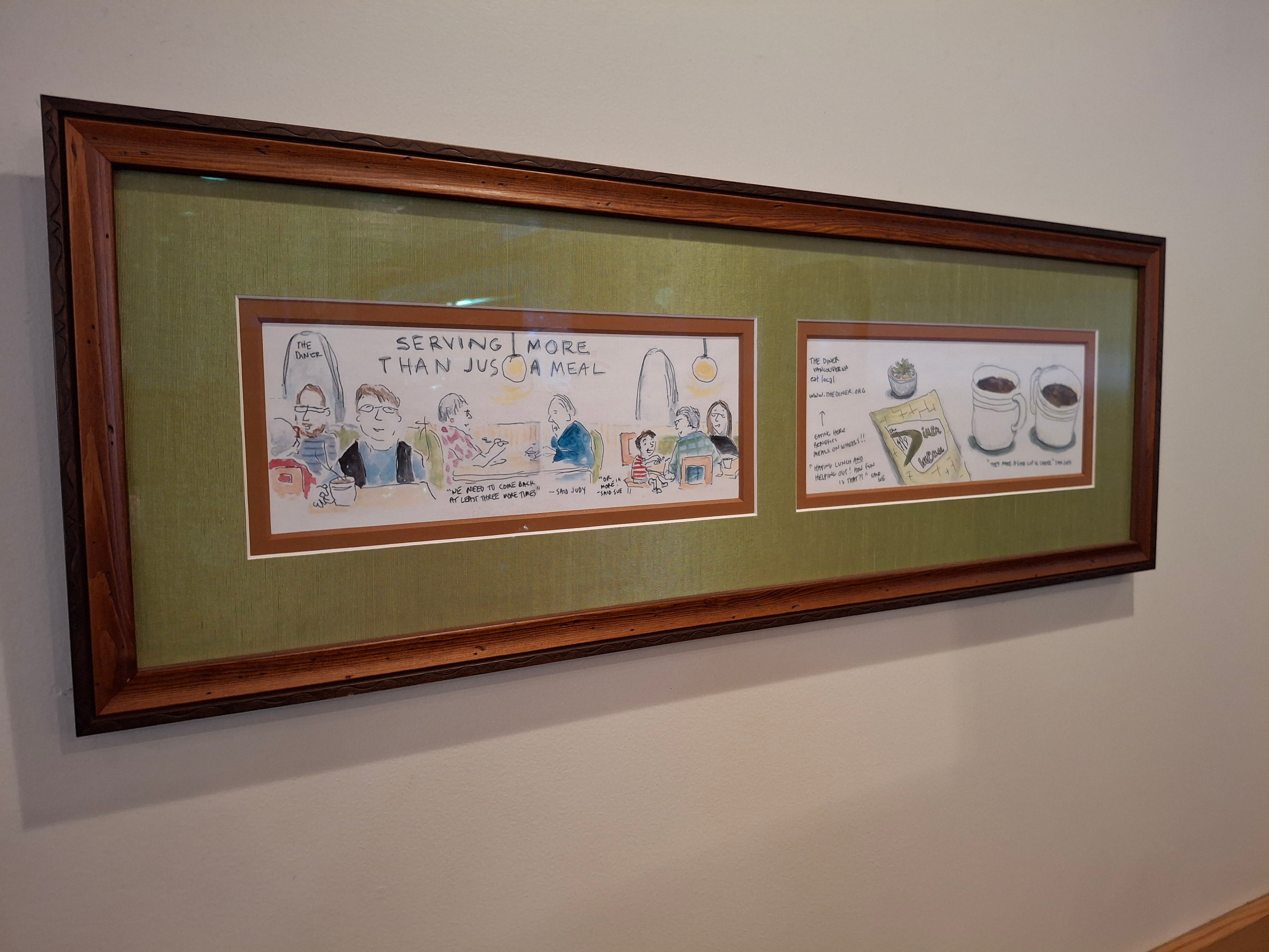
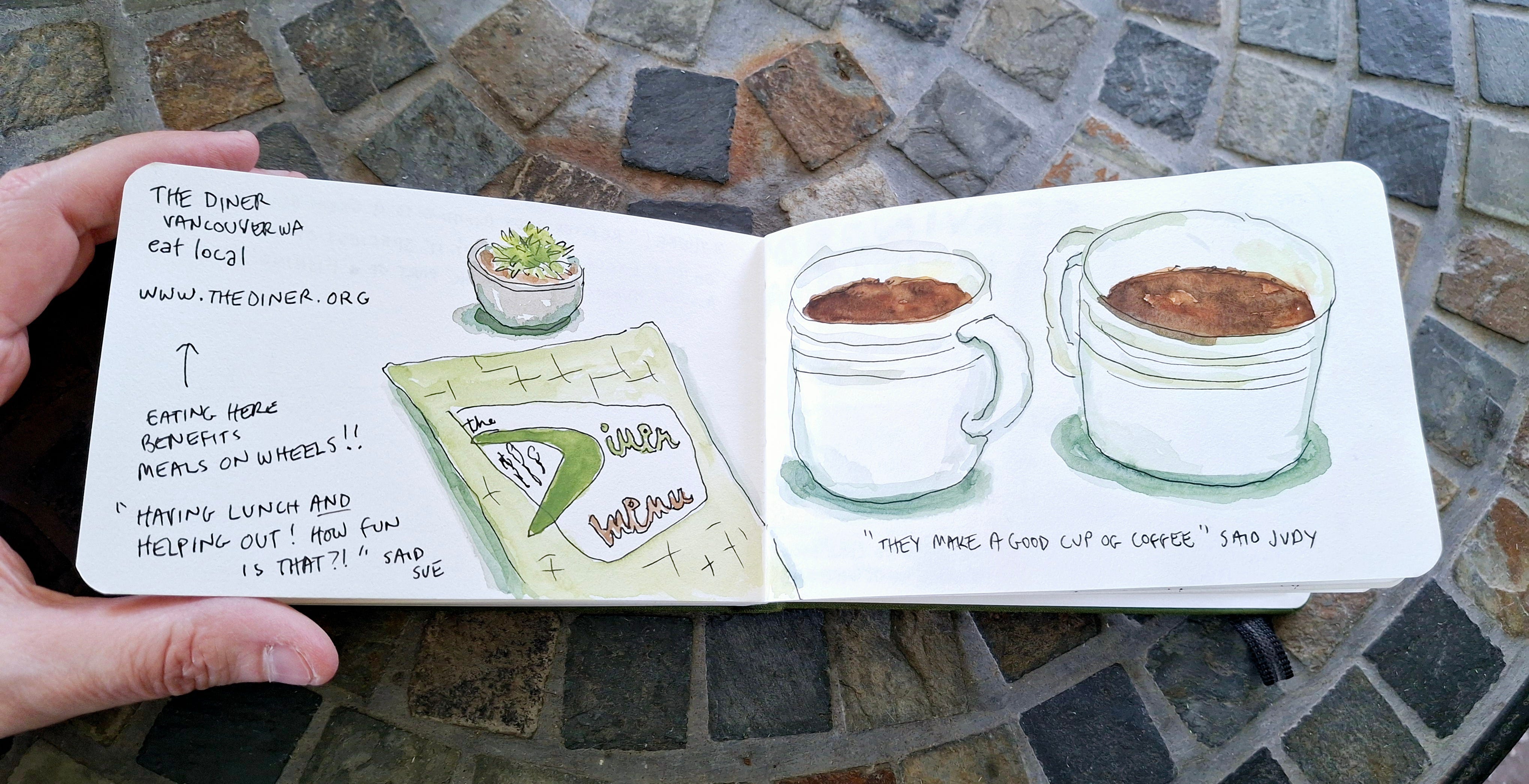
and I went to one of our favorite places for brunch. It's called “The Diner” and it benefits the Meals on Wheels programs. We eat here fairly often and usually sit in a booth. However all of our usual booths were occupied so we sat in a place we'd never sat before. I happened to look over and thought I saw my own sketchbook pages. So I stepped closer… and yes!! Someone at The Diner had printed out my 2019 sketchbook pages from when I'd shared them online, tagging The Diner of course! It made my artist heart happy to discover that they'd liked my artwork well enough to frame and display it in their restaurant!!! When we got home I found my original sketchbook from 2019 and photographed the pages to include here too ! What a fun surprise!! https://thediner.org/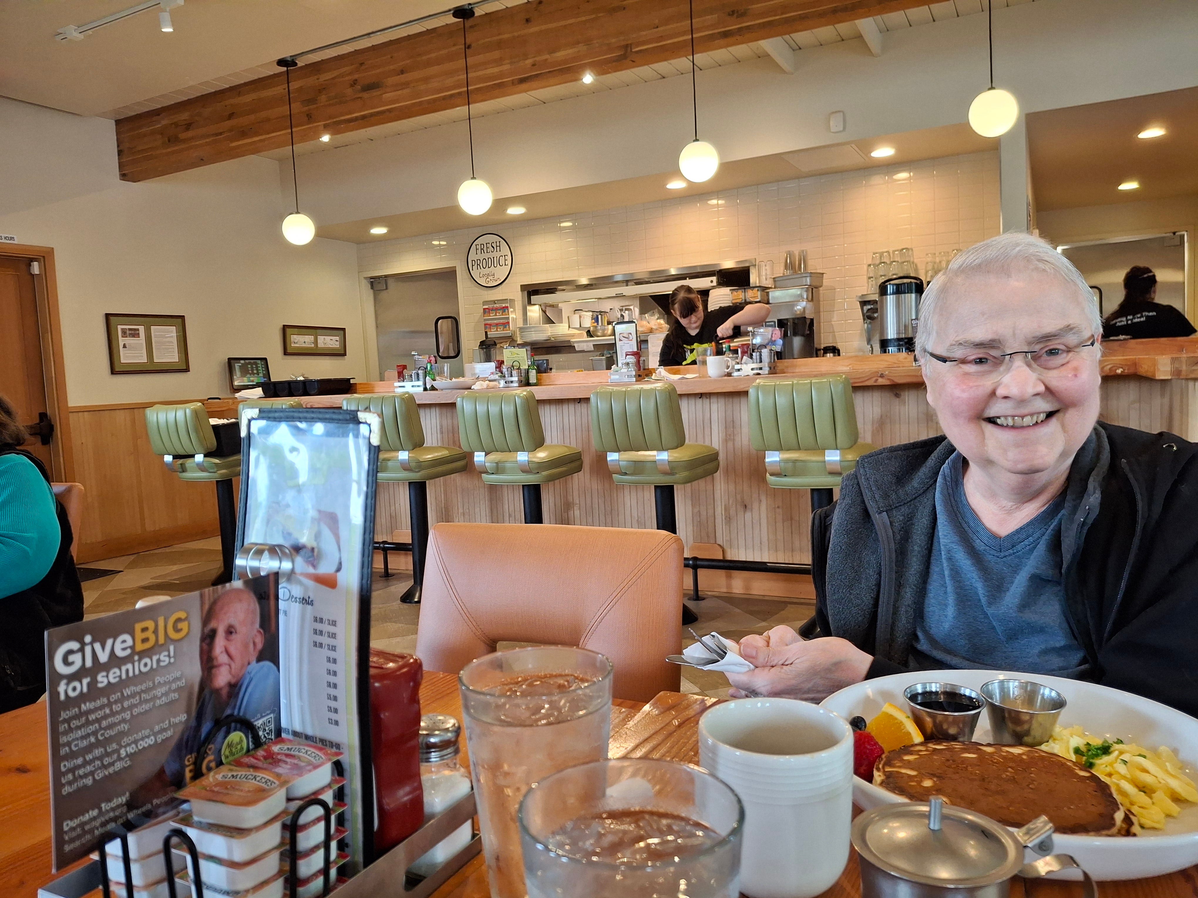
Thank you so much for reading my work! I appreciate it and I hope your weekend is full of delight!!

A very good color mixing resource for watercolor and acrylic… https://bookshop.org/a/86356/9781600588969
The Italian philosophy of deliberately doing nothing “Dolce Far Niente”
Here's the access link for my art album for my exhibit this year https://www.blurb.com/b/12431156-the-owl-and-the-pussycat-art-album
I love how you've incoporated your art into contact cards!
Somewhere I picked-up calling that color .... cinnamon. Like cinnamon candies? Anyway it is now what comes to mind. Love the bear taking a sniff of your freshly drawn flowers! Very nice post. Love hearing of happy times. :-)