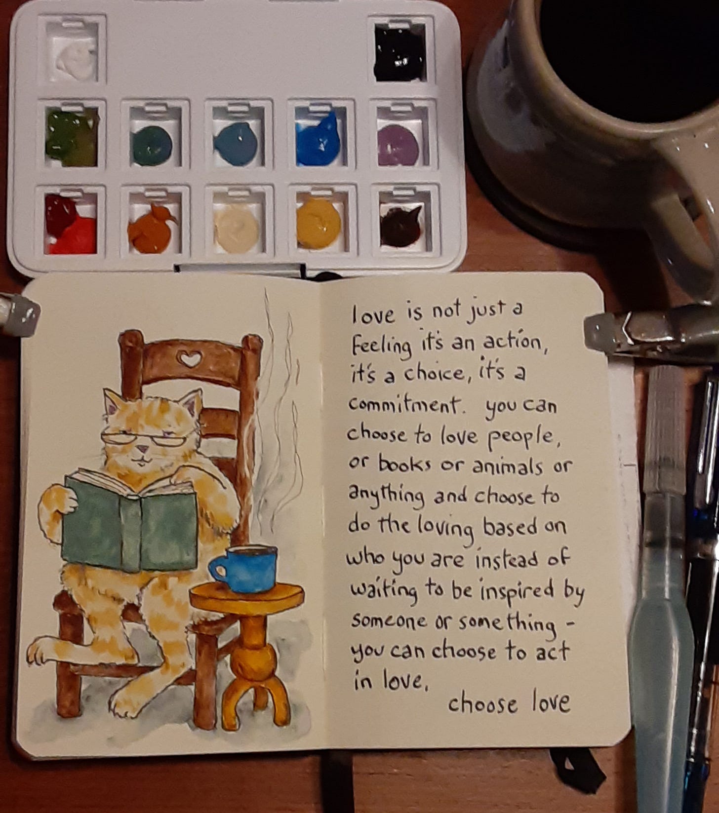
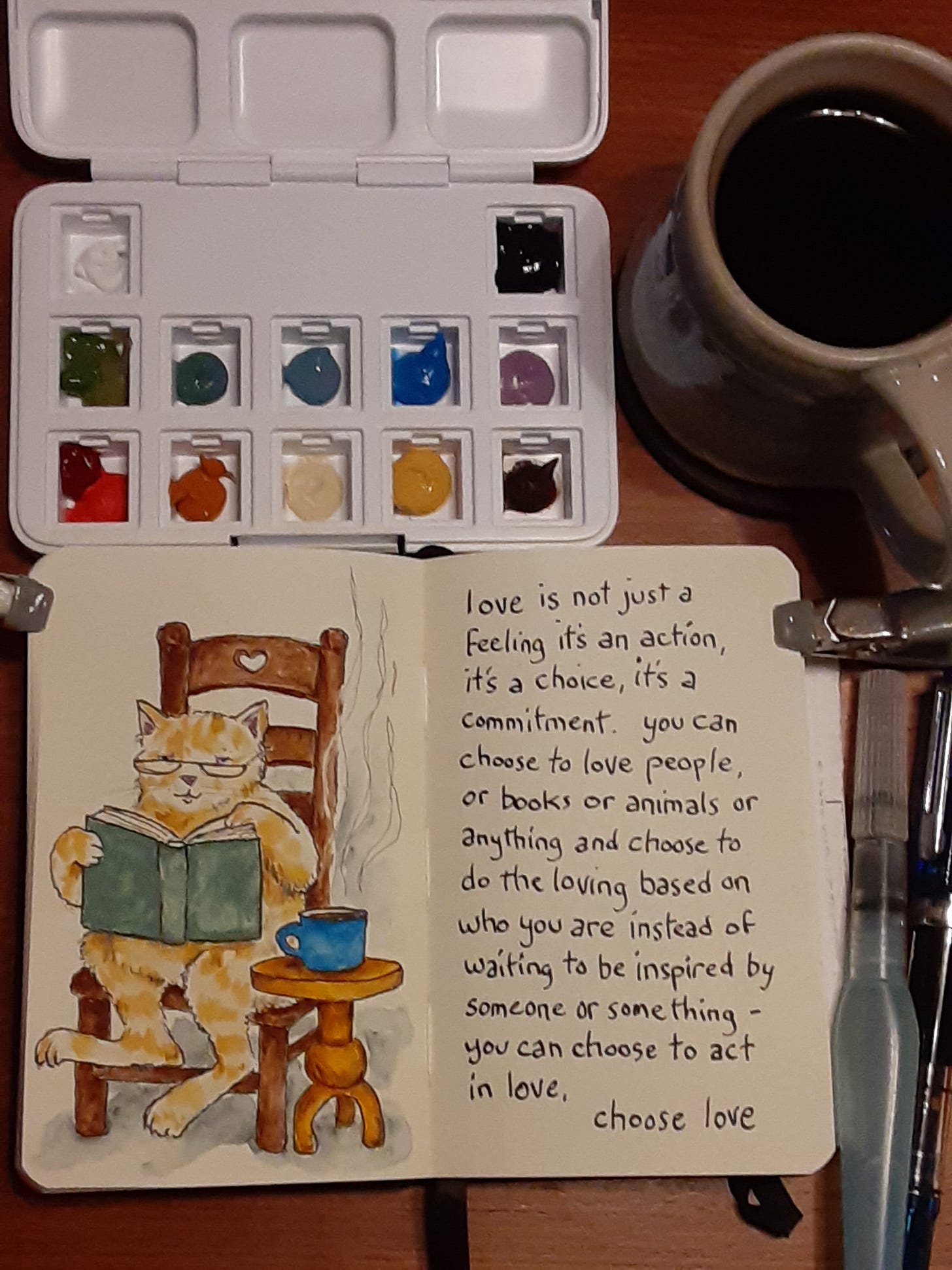
In my last newsletter one of the cozy comforts I had listed was a cat reading… which I painted this week in my sketchbook with my new self-selected paint palette. More on my new color choices in a second...
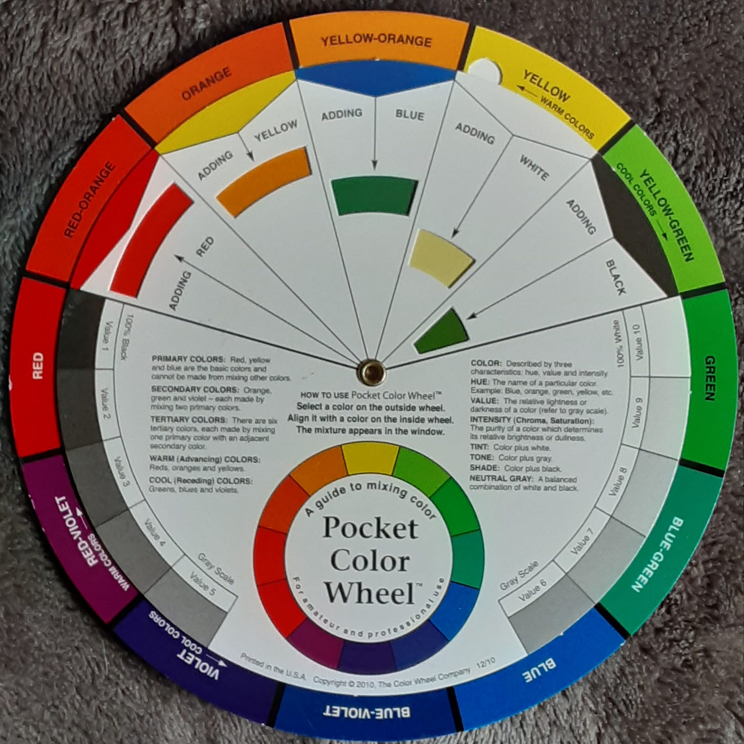
An eon ago when I was in university art school I had a color theory class. On the first day of class my professor told us to bring to the next class session three different 3 x 5 inch cards with each card fully covered with one color: one card would be yellow, another card would be blue and the third card would be red. It was firmly stressed that we should select the hues that we personally perceive as “true” our default/standard for the colors called yellow, blue and red.
On the second day of class everyone had their three cards with the three colors laid out on the tables. Professor went around gathering and thumb-tacking cards to the wall - when all of our cards were tacked to the wall we literally saw the color wheel.
Someone's “true blue" had leaned green and someone else's “true blue" had leaned purple and so forth right around the color spectrum.
I learned from that class to select my own tubes of paint colors rather than blindly accept a manufacturer's preselected or pre-set color palette. Or if I do accept a “color set" to do it with purpose and awareness. I also learned that our color perceptions are due to our physical eyes as well as our personal preferences - both of which change over time.
Fast forward to nowadays and every year or two I do a color checkup with myself asking what's “true" yellow, blue and red for me now?
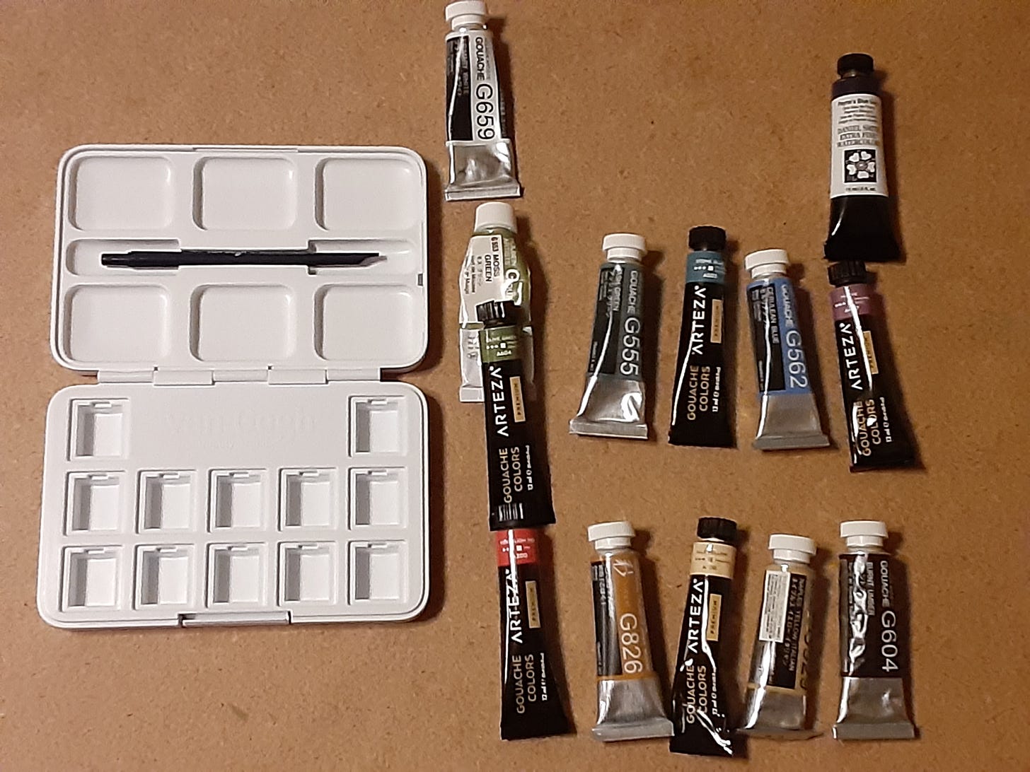
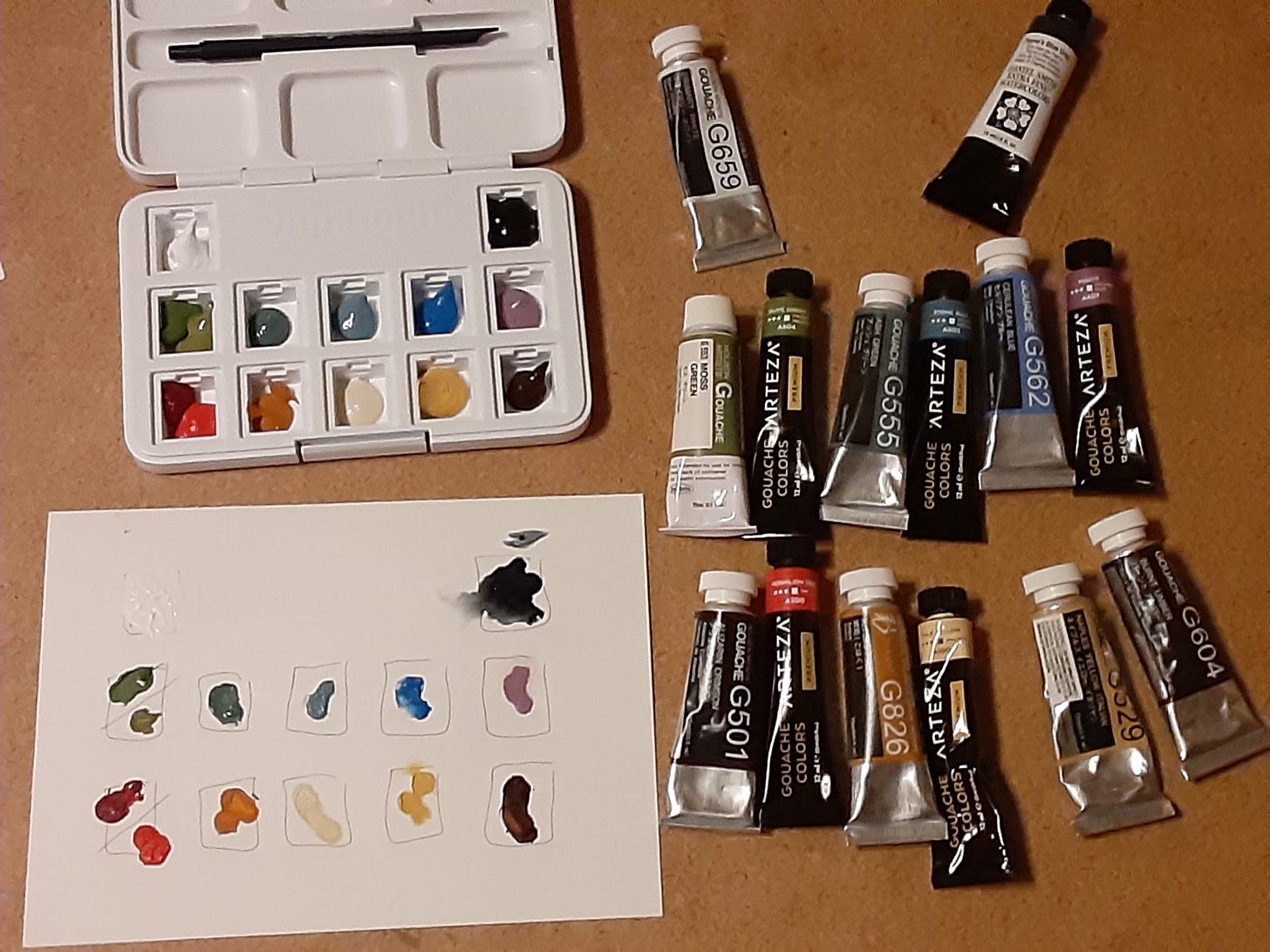
Lately I've admired the blues in the Pacific Northwest rivers and in the Pacific Ocean. I've enjoyed the blue greys of the river rocks, the pale yellow of the coastal sands and the muted reds of flowers in local gardens. Plus the greens of trees, oranges of butterflies and the lavender of distant mountains. So I bought a new empty palettebox with a lid and a few new tubes of gouache paints. Most of the tubes of gouache you see in the photo below I already had on hand just not in this particular color arrangement.
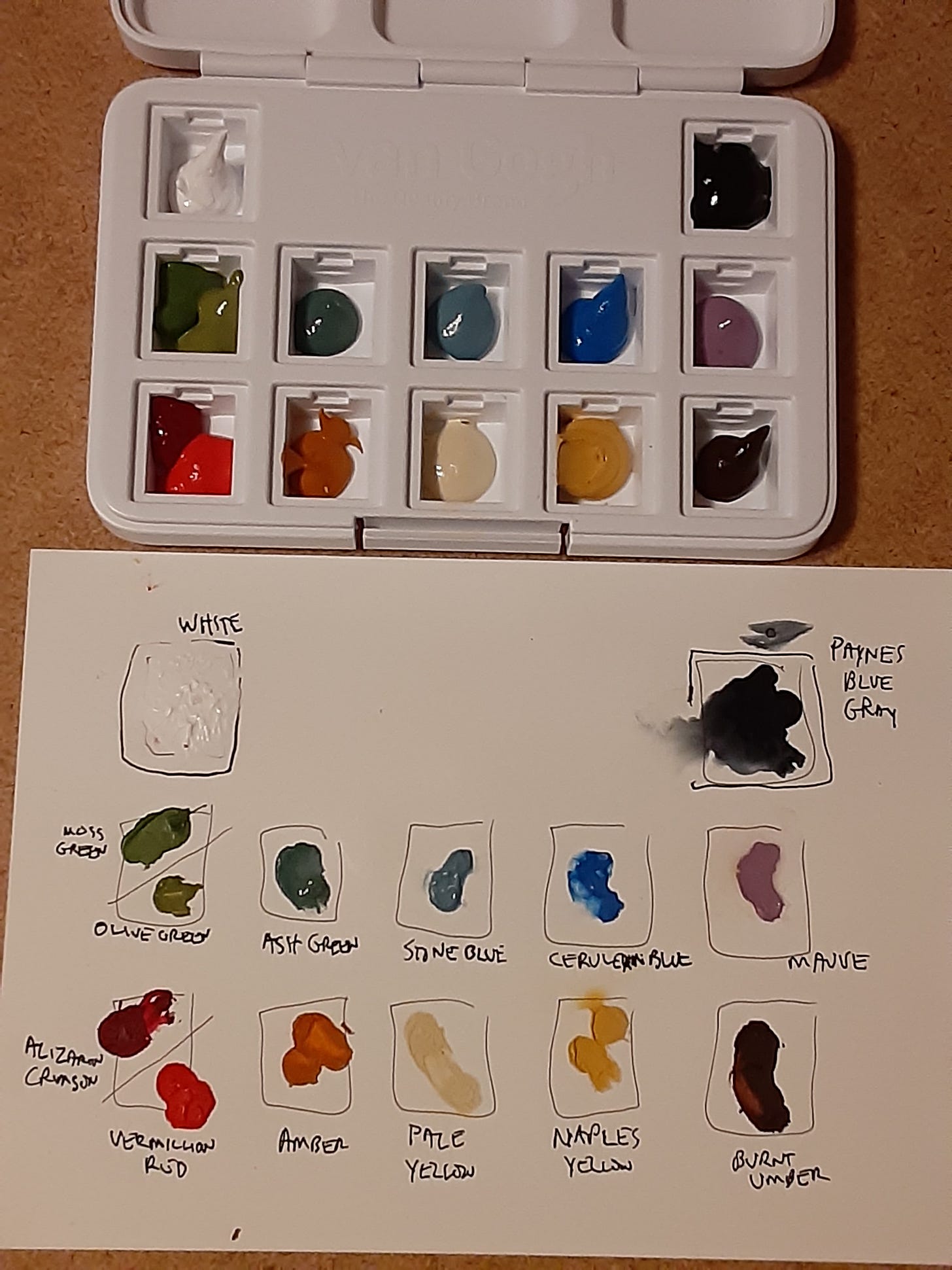
After selecting my new colors I squeezed some paint into each of the paint wells in my palette box. I also made a color chart at the same time so I'll have a record of what each color was when it comes time to refill the wells.
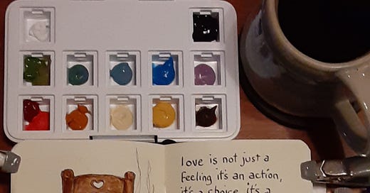
Here's a closer photo so you can see all of the colors.
As you probably see they're muted but still bold colors, more soft natural hues - even classical - rather than the primary-school kinds of colors that come standard in many off-the-shelf paint sets. Did you notice that there isn't any black on my palette? The two darkest colors are Paynes Blue-Grey and a Burnt Umber brown. When I want black I prefer ink.
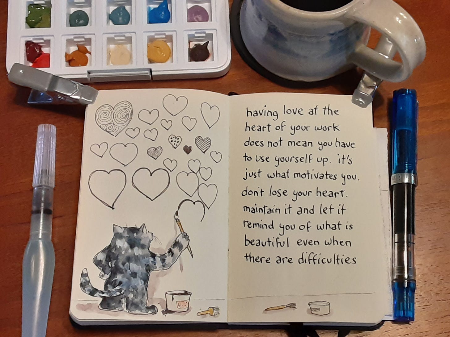
Here's some first sketchbook pages with my new color palette box:
Even though my new palette doesn't have real-life cat fur colors, for example, the colors still “read" as cat. That's one of the fun things about having my own color assortment - I can use my own color language to describe my thoughts and feelings about the world and yet other people can still recognize the characters and objects!
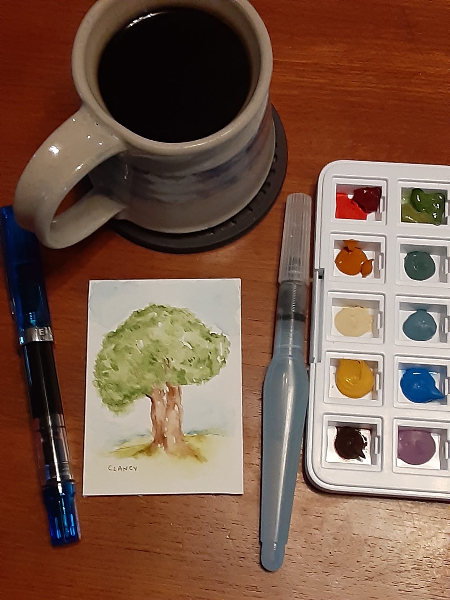
The paper in my sketchbook is creamy off white so I also want to check the new colors on different art surfaces. A different surface can give the colors a different appearance. So on another morning during breakfast I did a portrait of a neighbor's tree on the small 3.5 x 2.5 inch white board.
Here's a photo of the neighbors tree that I can see from my front windows. Please pardon the photo through the screen…I'm still wearing my pajamas so I'm not stepping outside. 😁
Here's the painting I did of that tree on a small white board. 👇
I enjoyed painting the tree on the board so on still another morning in my sketchbook I drew another version of my neighbors tree with ink and used just a touch of the new vermilion red color to see how it fitted (or not) with my ink in my sketchbook. As you can see from the above photo of my neighbors tree there isn't a park bench in real life. I do sometimes see (and say hello to) my neighbor sitting in a lawn chair under that tree and that gave me the park bench idea. Plus I like the feeling of reading in a park…
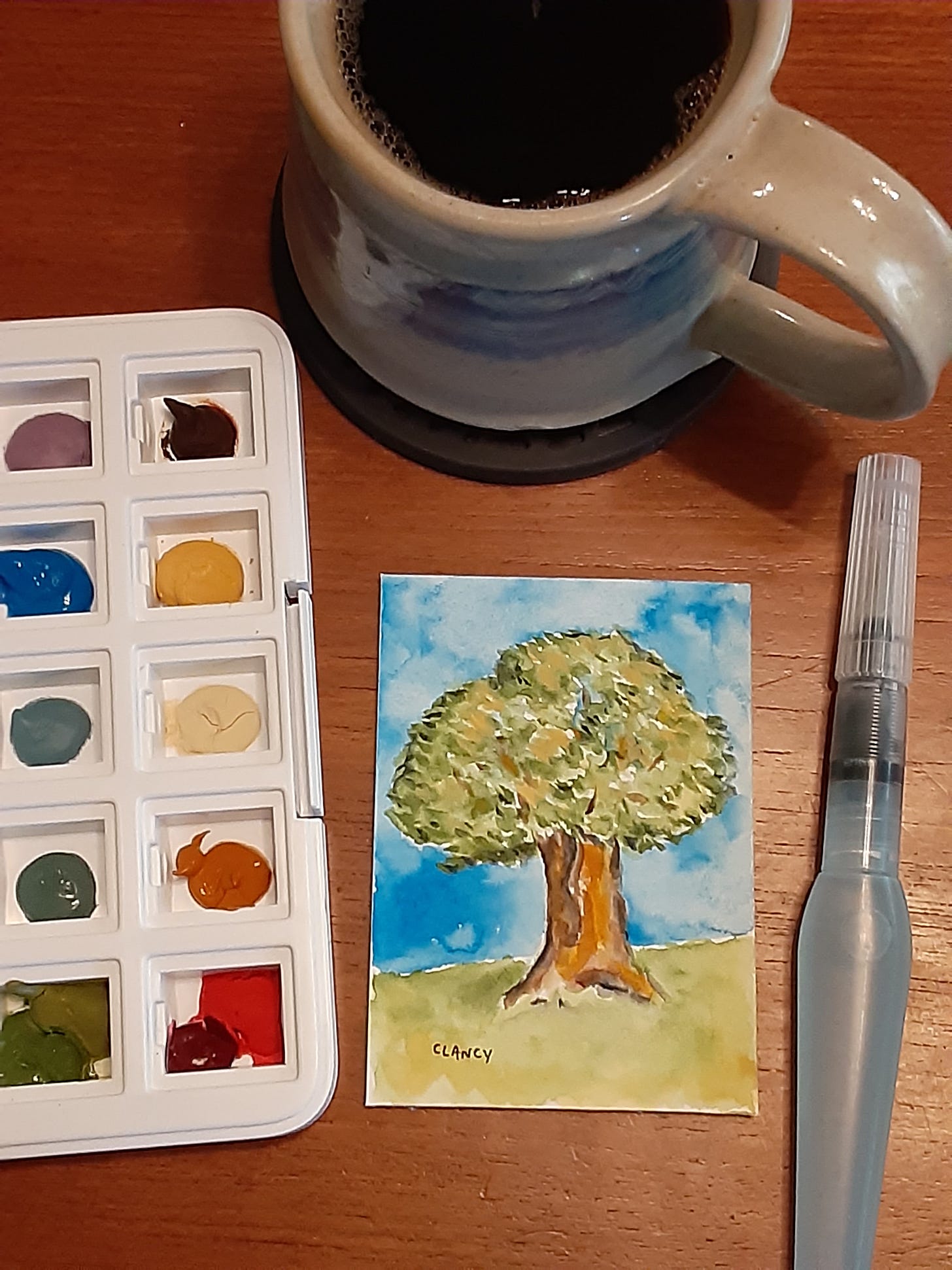
Here's another version of the same tree painted on still another morning with a different selection of my new muted colors on another small white piece of art board.
I might keep doing trees as a subject for a while because it's fun. 🤔
I hope your weekend is full of colors and other things that you enjoy!
Housekeeping note: I've begun a page that will, over time, collect all of the downloadable ebooks I've shared with my paid subscribers. As of this writing there are more than 10 ebooks in my archives that I've written and illustrated. So I'm trying to make all of my ebooks more easily accessible. There are 6 downloadable ebooks on this page currently and more to come soon. 👇
Clancy ebooks
Here, for paid subscribers, is an index of ebooks published by Sue Clancy. I hope you'll enjoy them! Thank you again for subscribing! Another Sketchbook by Clancy (a complete sketchbook you can download) is in this newsletter 👇 Alphapets by Clancy (one of the children's books I've written and illustrated that you can download 👇)






I enjoy watching these being created and posted as well as seeing what you say about them. Please keep up the good work!
I love your sketches and the writing next to them. I’m so I inspired by them. What is that cake? It looks delicious.